It’s been a while (something like 3 years) since I’ve written a blog post, so I thought I’d do a very brief update and then talk a bit about a recent paper I helped write. Since the last post, I moved onto a new position as a CIRADA software developer. In this new role, I work on generating kinematic models for galaxies that are observed as part of the WALLABY survey. I’ll have a full post on that sort of thing in the near future. But the key thing is, in this new role, I’ve had even more work to do and less time to do it all in. It’s a bit of a good problem, but sometimes there’s things that fall a bit to the wayside.
That being said, I’ve been doing lots of research, and getting a lot of work done. One of the fruits of that is a recently accepted paper called ASymba: HI global profile asymmetries in the Simba simulation, which was led by Marcin Glowacki. It’s a bit of a handful, but I thought I’d try to explain a bit of what we did in this paper.
There’s a few pieces of background information to the paper that most astronomers know that we need to go through first. First off, what is HI? The answer is that it is neutral hydrogen gas. Most spiral galaxies contain lots of this stuff and it gets used to form stars. This gas tends to extend out a lot further than the stars, and it tends to be more sensitive to all sorts of processes, like interactions with neighbours, stars exploding, supermassive black hole activity, and more. Because of all these properties, astronomers like me really like studying them.
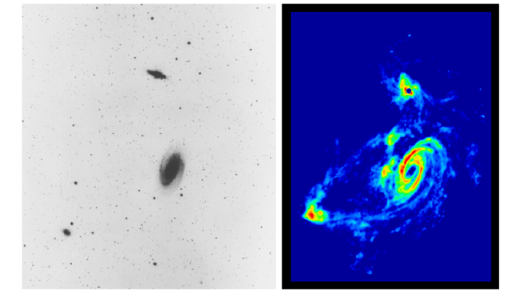
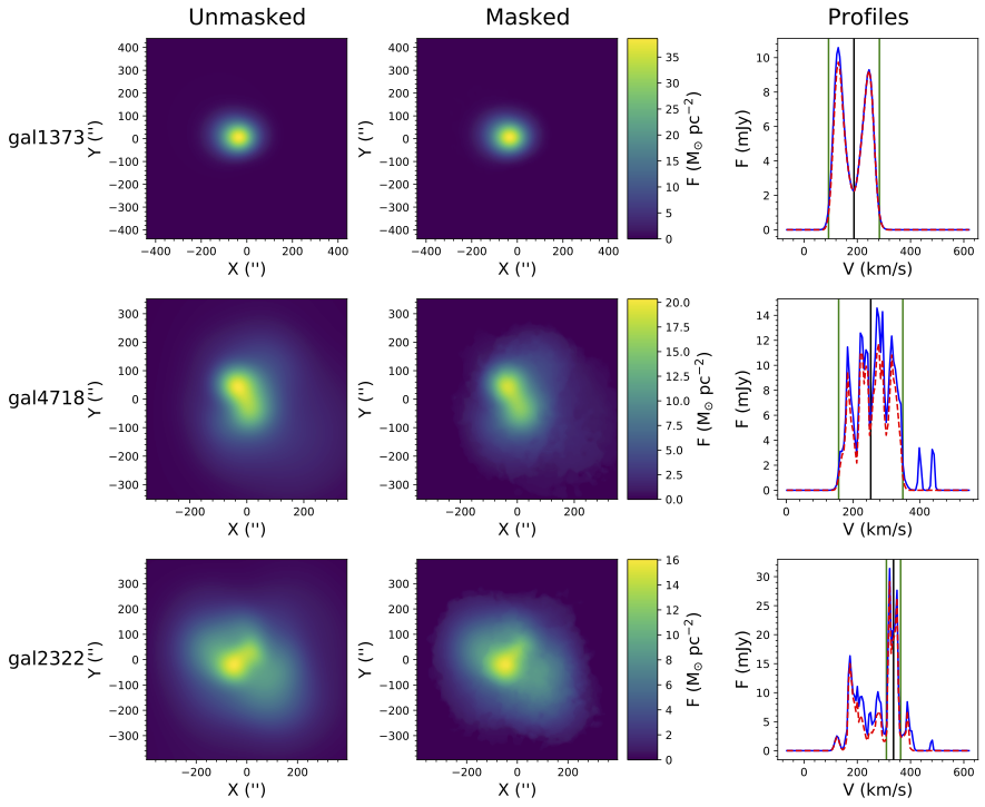
The way that we can see HI is to use radio. Neutral hydrogen has a property that causes it to emit light that has a size of 21 cm, which is squarely in the radio band. But, because it’s in the radio band, the resolution is very low, so we can’t get a lot of detail. Most of the extragalactic HI that we observe isn’t seen like that wonderful image of M81 above. Instead it usually is a dot on the sky. However, observing in radio gives us one huge advantage…we can see how fast the gas is going!
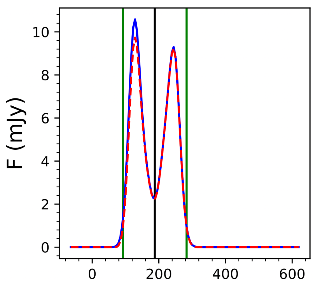
What this means is that, even when a galaxy is a doubt, gas that moves at different speeds will show up in a radio dish at different frequencies. This makes up what we call a ‘velocity profile’. Velocity profiles are a key tool of an extragalactic astronomer as they can be used to figure out how much stuff there is in a galaxy, figure out things about dark matter, and all sorts of other interesting science! One thing about velocity profiles, is that, for a nice spiral galaxy that is rotating around some center point, it ends up having a ‘double-peaked’ profile, like the image on the left.
Now, when a galaxy is disturbed in some way, that profile can get messed up a bit. There might be a bit more gas moving towards us than away from us, or some other weird feature. The key point is that, rather than being a nice, symmetric profile, the velocity profile becomes asymmetric! On the right hand side you can see an example of an ‘asymmetric profile’, where one side has a lot more gas than the other side.
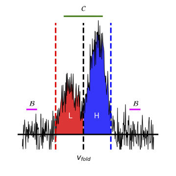
Earlier I said that most HI gas that we see is in the form of a profile, rather than like that image of M81. But, it might be possible to approximate how many galaxies have weird and wonderful gas distributions by measuring how many velocity profiles in a survey are disturbed and asymmetric. But to do that, we need to have some way of quantifying that asymmetry. In an earlier project Deg et al. (2020), we worked out a few ways of quantifying that asymmetry. It’s maybe a bit much to go into detail on different ways, but for right now it’s probably sufficient to note that, we actually have 3 different techniques.
Before we tackle real observations, we thought the first thing to do is to look at simulations. It’s possible to make ‘mock’ observations that look like what we’d see with a telescope. But we can do even better than that, because we can make those observations without noise. The great thing about that is then we know that any asymmetry we see is because the gas is disturbed. The simulation that we chose to analyze for this project is the Simba cosmological simulation (and yes, it’s named after the Lion King).
The reason why we wanted to look at a simulation is so that we can figure out all the things that can disturb the gas of a galaxy. In the Simba simulation we have all sorts of information about what is going on in a galaxy at any given time. We know how much gas, stars, and dark matter there is, how many stars are forming, when the last time a galaxy merged with another galaxy, how close galaxies are to each other, and all sorts of other parameters. And what we found was pretty surprising.
The first thing is that there are lots of things that can mess up galaxies! We had 4000+ galaxies to look at, so we did things like group galaxies by gas mass, by the time since their last merger, how many stars were being formed and more. And when we’d look at all the galaxies in say the ‘low number of mergers’ bin, we’d find lots of asymmetric and symmetric galaxies. When you see something like that, you can tell that the some of the asymmetries are caused by things other than mergers. And we’d consistently see this no matter which parameter we looked at. That’s how we can tell many things are disturbing the gas.
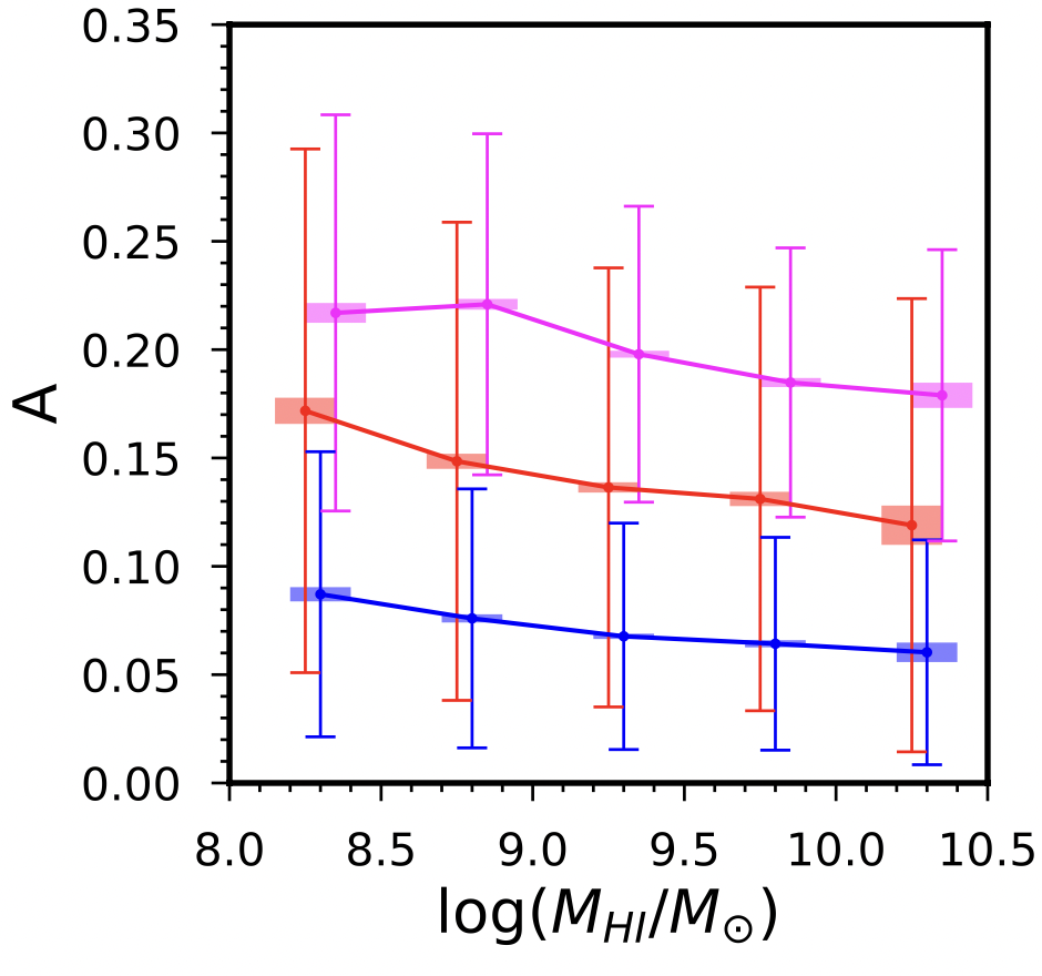
But, we were able to tease out some things. For instance, we say that galaxies that have more HI gas tended to be more symmetric than galaxies with less HI gas. We figure that these big galaxies are probably harder to disturb. We also were able to select galaxies that have the same amount of stars in them. When we looked at only the low mass galaxies, we found that the number of mergers had a stronger effect on them when we compared them to higher mass galaxies. We were also able to see that galaxies that more asymmetric tend to be making more stars than symmetric galaxies.
So what does this all mean? And the answer is, in many ways, we don’t know. We know that we can calculate asymmetries, and we know that disturbances in the gas are caused by physical processes. But there are so many things that can disturb the gas in galaxies, it’s still hard to isolate the core drivers. Luckily, Simba has a cool feature where they’ve run the simulations a few times using different physics. That’ll let us isolate a bit more of which type of process is driving the gas disturbances. Another thing that we’ll be able to do is to pick some interesting galaxies and trace them backwards in time. That’ll help us to figure out when the galaxies were disturbed and what happened to them. We’ve only just begun to scratch the surface of what’s going on. And, once we understand what causes asymmetries, we’ll be able to look at some of the large surveys that are occurring now and try to relate the rates of asymmetric galaxies to symmetric galaxies to the underlying physics. We’ll be able to learn about how often mergers occur as we go back in time, when starbursts are happening, and so much more. And all from measuring how messed up these simple looking velocity profiles are!